poshmark
I challenged myself to redesign the Poshmark App. An avid user myself and an industry I am extremely passionate about, re-sale & sustainable fashion, I wanted the redesign to reflect and beautiful, simplistic design with a user-centered focused.
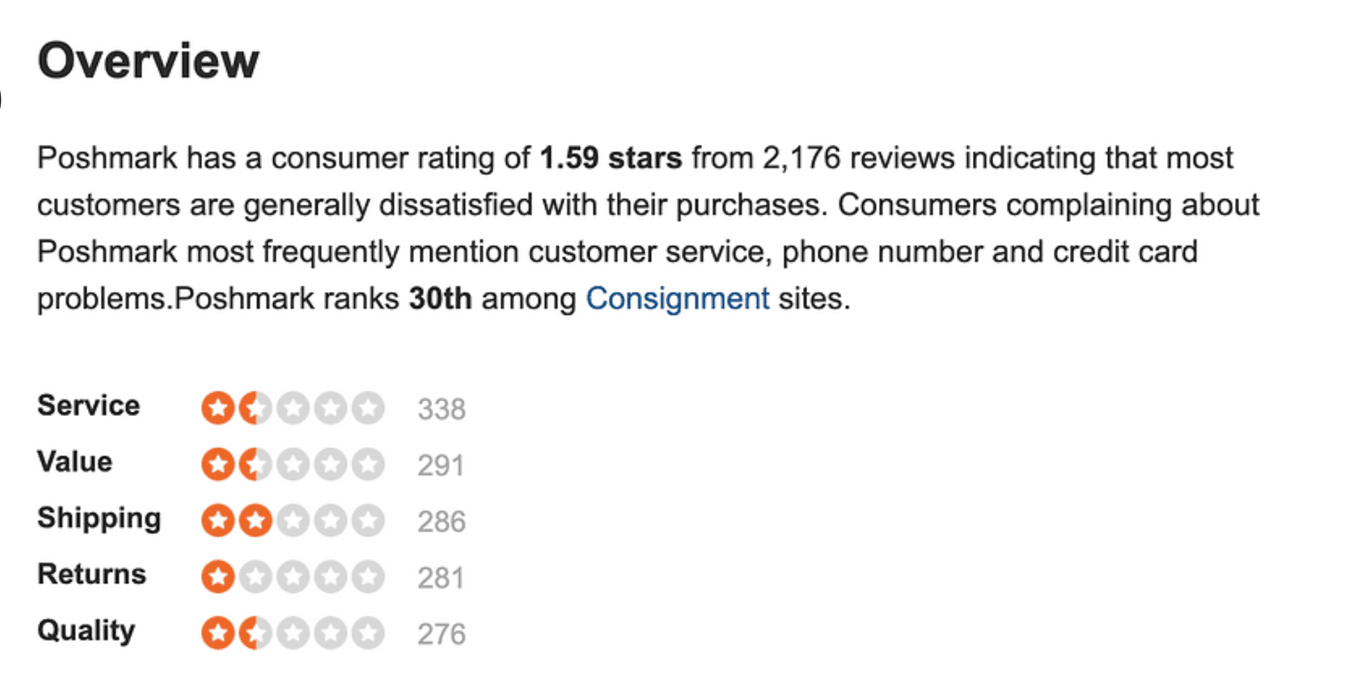
I extracted my own pain point of the app to lead the design changes. I acknowledge as a Product Designer, ethnography and empathizing with the target users is essential. In order to account for user testimonies outside of my own, Poshmark review pages & Reddit pages were used to gain insight on a wider range of areas of improvements.
why?
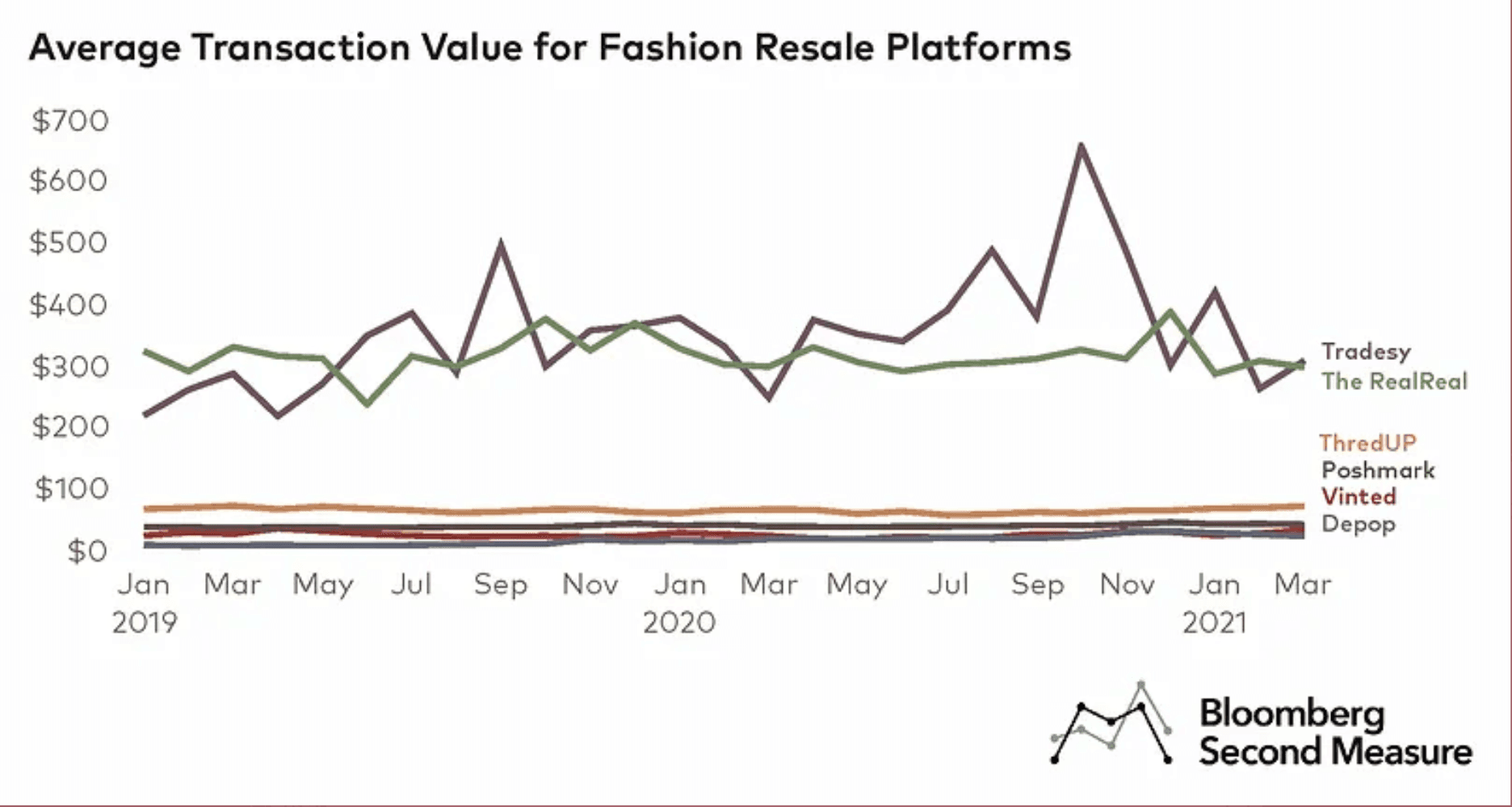
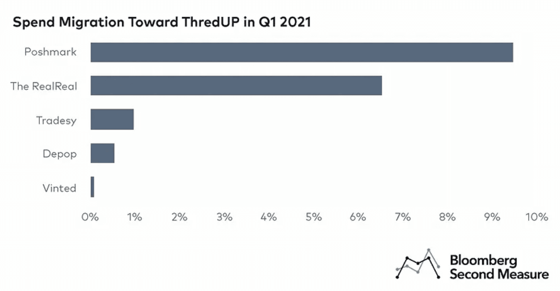
In a rapidly growing market space, ThredUP’s sales growth outperformed the market, resulting in a relative share growth—or growth rate of market share—of 18 percent, over half of that percentage came from Poshmark according to Bloomberg Second Measure.
In order for Poshmark to continue to thrive in the every evolving space of resale, they must first focus on their users and creating a communal, intuitive space for their users to buy and sell.



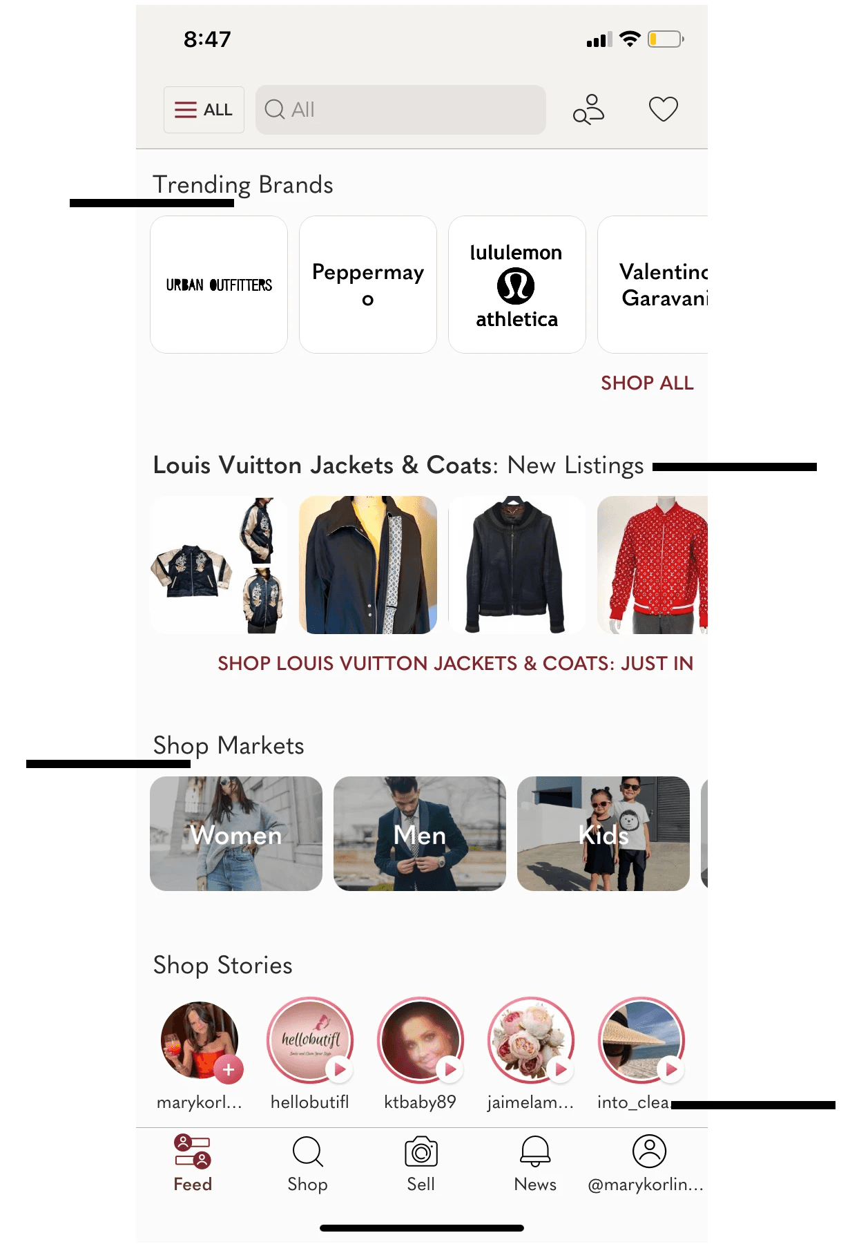

Business Constraints: To satisfy shareholders & the market, I acknowledge that the business has key growth metrics with respect to engagement, retention, and revenue, which are achieved by various features incorporated into the UI. That said, I challenged myself to find a balance between a seamless user experience and features critical to the growth of the business.
Elements to maintain: Trending Brands, Brand: New Listings, Shop Markets, Stroies: New Listings, User or Boutique shared listing, Shop Trends, Posh Ambassadors
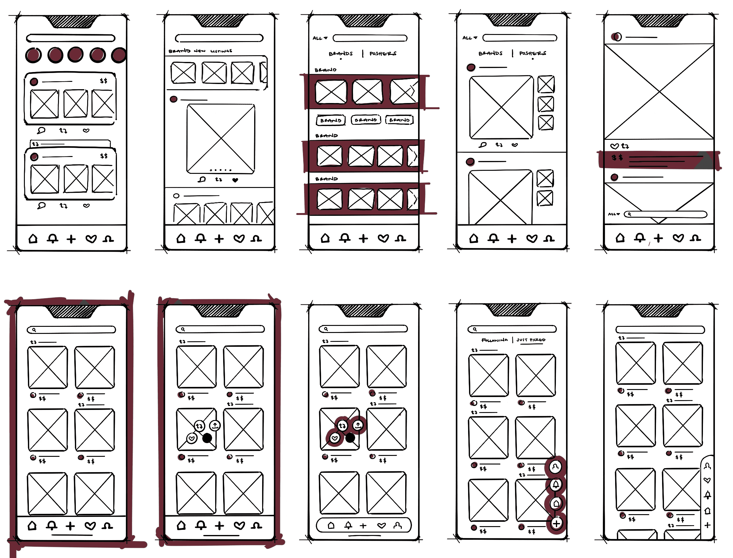
Wireframed how each major screen within the Poshmark app could look like for the redesign.
Wireframed how each major screen within the Poshmark app could look like for the redesign.


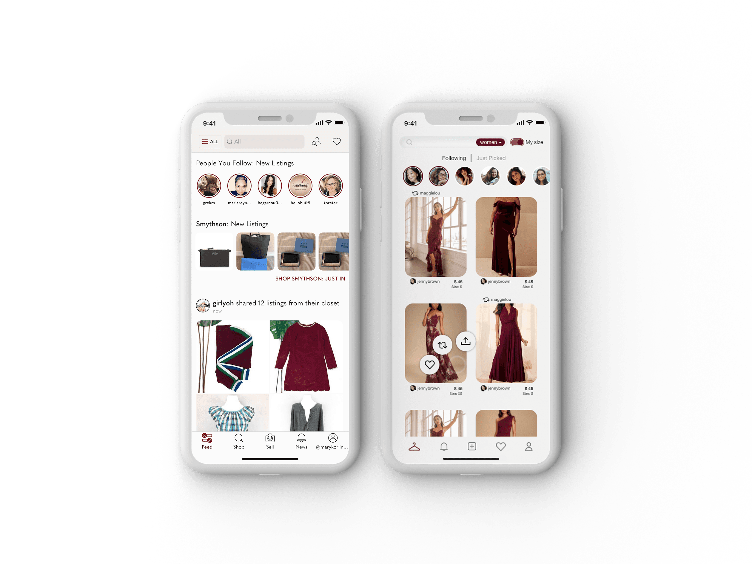
after
before

after
before

after
before
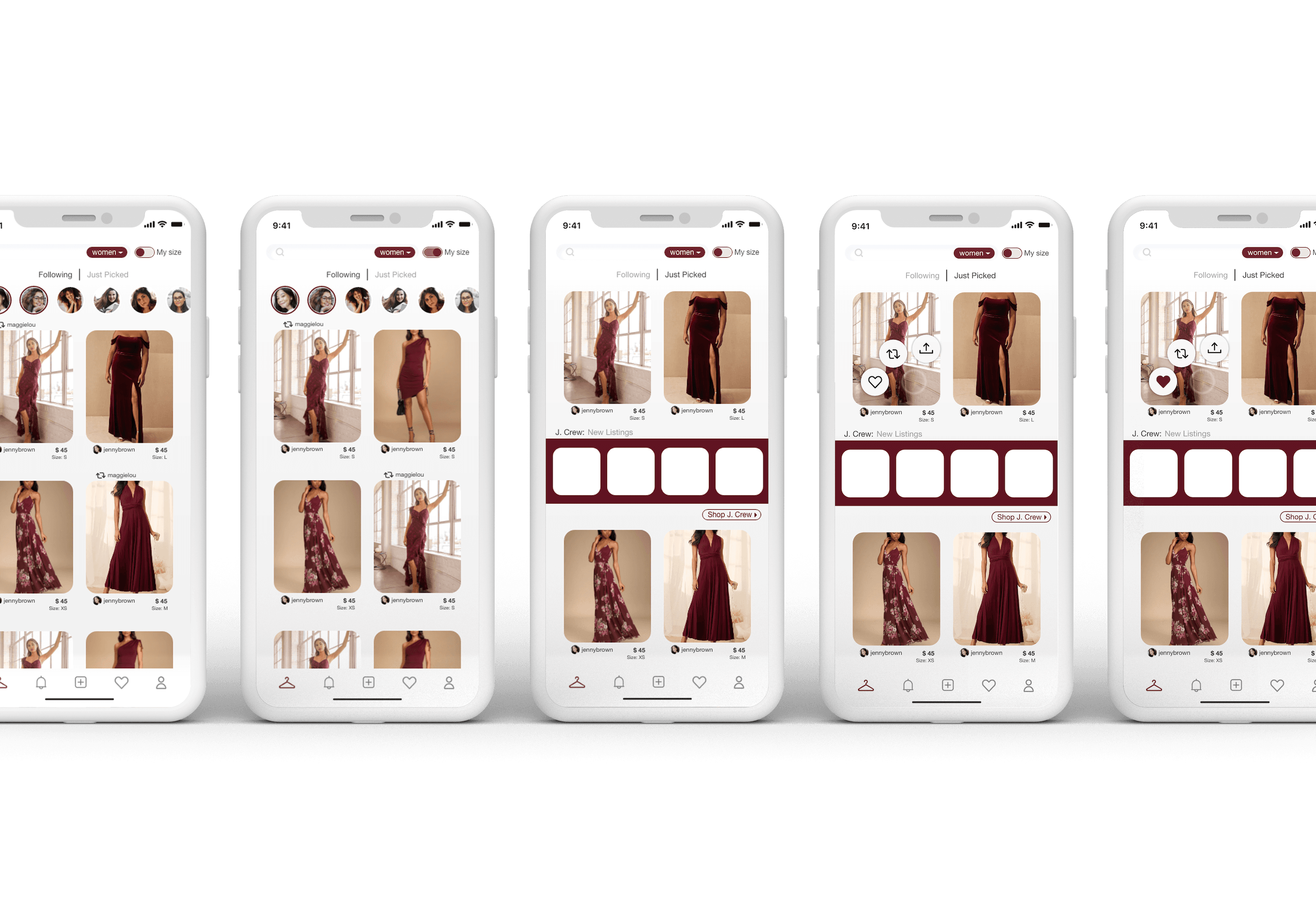
The feed screens below utilize many different elements that stay within
the 'Feed' tab on the redesigned toolbar.
I find myself looking at the 'Just Picked' section which is within the 'Shop' tab on the original toolbar. This feature compiles pieces that the Poshmark algorithm believes applies best to each individual user, similar to the FYP on TikTok. Making the connection between these two platforms, I designed the Poshmark home feed to read similarly. This allows the 'Following' page of the feed to be clean and easy to navigate while the 'Just Picked' page will incorporate the business critical elements like new listings from brand or trending pieces.
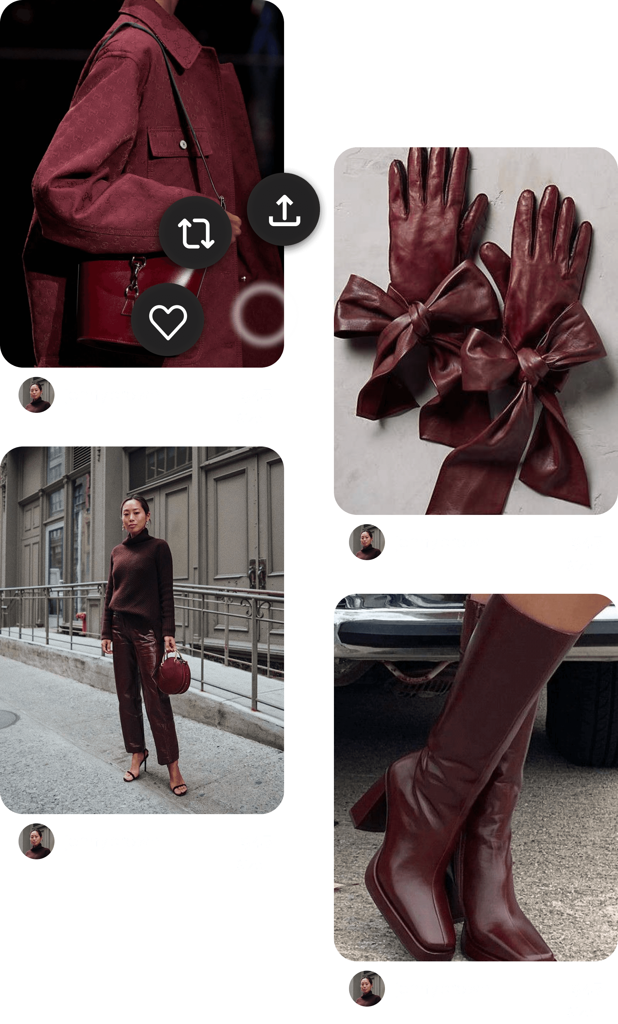
The Pinterest app was another area I took inspiration from. In order to clean out some real estate, users simply hold down on a listing to then slide west to like, north west to repost or north to share the listing. As the 'fashionista' of my friend group and Poshmark user, I find myself sharing listings via text quite often to share my finds with my friends and encourage them to shop second-hand. To comment on the listing, the user clicks the image to open up the product page (redesign to come at a later time).
Two other features to mention are the search bar, the 'Shop Markets'dropdown* and the 'My size' toggle**. The dropdown allows users to navigate between different markets: women, men, kids, pets, home, etc. The 'My size' slider allows the user to dictate if they only want to view their (previously set) sizes or to view all sizes.

*

**
